

NWE APP
Designing a digital experience to connect a distributed Catholic community in the north west Europe region: The Netherlands, Ireland, United Kingdom and Scandinavia
UX RESEARCH
PROTOTYPING
PRODUCT STRATEGY
DEV HANDOFF
UX UI DESIGN
BRANDING
DESIGN SYSTEM
Context.
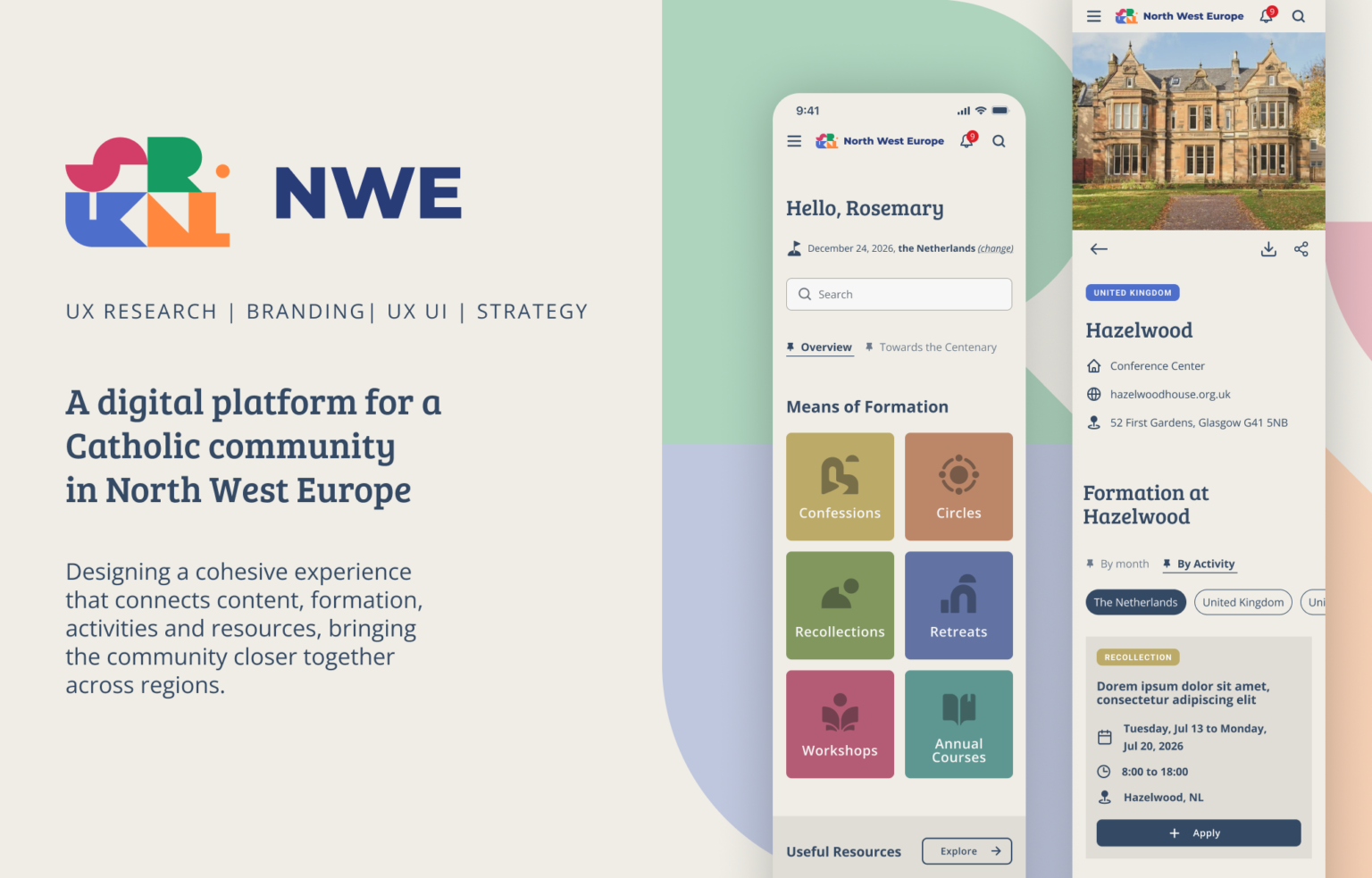
A digital platform for a distributed community NWE is a digital product designed for a Catholic community connected to Opus Dei across Northwestern Europe.
The project explored how a dedicated digital experience could bring together formation, content, community activities and communication within a community already accustomed to using multiple digital channels.
Rather than simply creating another place to publish information, the goal was to identify where a centralized product could reduce fragmentation, improve discoverability and make participation easier.
Challenge.
How do you design a new digital product for a community that already has many ways to communicate?
The NWE community already relied on a distributed communication ecosystem: local center communication, Instagram accounts, WhatsApp groups, diverse institutional websites, registration platforms, PDFs, e-books and in-person communication.
WhatsApp in particular played an important operational role, supporting announcements, invitations, events, questions, spiritual content and day-to-day community interaction.
This created a fundamental UX challenge:
A new app could not simply replicate what existing channels already did well.
The opportunity was to understand what a dedicated product could do better: make information easier to discover, connect content and activities, and create a clearer path from discovering to engaging and participating.
Research.
Understanding and mapping the ecosystem before designing the product
The research showed that digital communication was deeply embedded in the existing community structure.
Rather than treating users as a single demographic group, I looked at behavior and relationship with the community, aiming to understand:
– how frequently people participate;
– their role within the community;
– how they currently consume information;
– what motivates engagement;
– their relationship with a local center or remote community;
– whether they actively search for information or discover it passively.
One of the most important findings was that existing channels were not necessarily the problem; they already worked for specific purposes.
The opportunity was therefore not to replace those channels, but to create a product that could connect and complement those behaviours.
Product opportunity.
From a fragmented communication to a connected experience
The research shifted the question from “How do we build an app?” to “What should this product make easier?”
Three opportunities emerged:
DISCOVER: Make relevant content, activities and information easier to find.
CONNECT: Create clearer connections between people, local communities and the wider NWE network.
PARTICIPATE: Reduce friction between discovering something and taking action, whether joining an activity, accessing formation or engaging with the community.
→ This became the foundation for the product structure and experience.
Information architecture.
Making a complex content ecosystem easier to navigate
The platform needed to accommodate different types of content without turning the navigation into a long list of unrelated sections.
I structured the information architecture around the content and behaviors identified during research, keeping the original content taxonomy clear and recognizable.
The structure included:
– Tailored information: content relevant to each user’s profile;
– Categorized news;
– Activities: including workshops, retreats, recollections and confessions;
– Venues: a comprehensive directory of locations;
– Notifications;
– Useful resources.
The goal was not to reinvent the information architecture, but to make a broad and fragmented ecosystem easier to understand, navigate and explore.
User journeys.
Designing around real goals
Rather than designing screens independently, I mapped key user journeys to understand what users were trying to accomplish and what information they needed at each step.
The journeys helped define:
– entry points;
– navigation;
– content hierarchy;
– CTA placement;
– recurring page structures and components;
– interaction patterns.
This allowed the interface to evolve from user needs and product structure, rather than from individual screens.
Brand → Product.
Translating the identity into a digital experience
The project was not limited to UX and interface design. The visual language needed to establish a recognizable digital identity for NWE while remaining functional across different types of content and interactions.
I translated the brand direction into a UI language through:
Typography · Colour · Iconography · Layout · Components · Imagery · Interaction
The goal was to create an interface that felt distinctive to NWE without compromising usability or scalability.
Design system.
Building a consistent product language
I created a component-based design system in Figma to translate the visual direction into a consistent and reusable interface.
The system defined the foundations and reusable patterns needed across the product, including:
Typography · Colour · Buttons · Navigation · Cards · Content modules · Icons · States · Responsive behavior
Components and interface states were structured in Figma to support consistency across the product and a smoother transition from design to development.
UI Design.
From structure to interface
With the product architecture and design system established, I designed the responsive interface across the core product experiences.
The UI balances content density, discoverability and visual hierarchy, allowing different types of information to coexist within a consistent experience.
The final interface was designed across desktop and mobile, adapting layouts, navigation and interaction patterns to different screen sizes while preserving the underlying product structure.
Validation & iteration.
Transforming feedback into product decisions
Feedback came through different channels: messages, voice notes and calls; and varied in format and level of detail.
I processed and documented each input, then evaluated it against the product goals and UX principles to distinguish between:
MVP: what needed to be addressed now
Decision: what required strategic discussion
Challenge: what needed to be questioned
V2: what could become a future opportunity
This helped turn fragmented feedback into clear product decisions, while keeping the MVP focused and avoiding unnecessary complexity.
Handoff.
From design to development
With the final UI approved, I prepared and handed off the design to the development team.
The final Figma file brings together the responsive screens, reusable components, interaction states and design system, creating a shared reference for implementation and marking the transition from product design into development.
Result.
A complete product foundation ready for development
The project translated a complex and distributed communication ecosystem into a coherent digital product experience. The final outcome includes:
A defined product structure
Clear information architecture and navigation across multiple content types.
A complete UX/UI system
Core journeys, responsive interfaces and reusable components designed as one system that can grow with the brand.
A distinct digital identity
The NWE brand translated into a consistent interface language, that can expand over time.
A development-ready foundation
Final UI, components, states and documentation handed off to the development team.
The result is not simply another communication channel. It is a structured digital foundation designed to centralize information and make easier for people across NWE to access relevant news from the community, discover and engage in activities and events.
What the client said
Credits & Mentions
Special thanks to Jose van Dijk, Mercedes Zalbidea, Mary Kelliher, Isabel Blanco and Helena for trusting me with this project. Grateful as well to Ana Ferrer-Bonsoms for the valuable insights and dedication throughout the development phase.